Opus 0.7.4 · Neumorphism · 2026-10-01
Introducing Neumorphism: a softer surface for Opus.
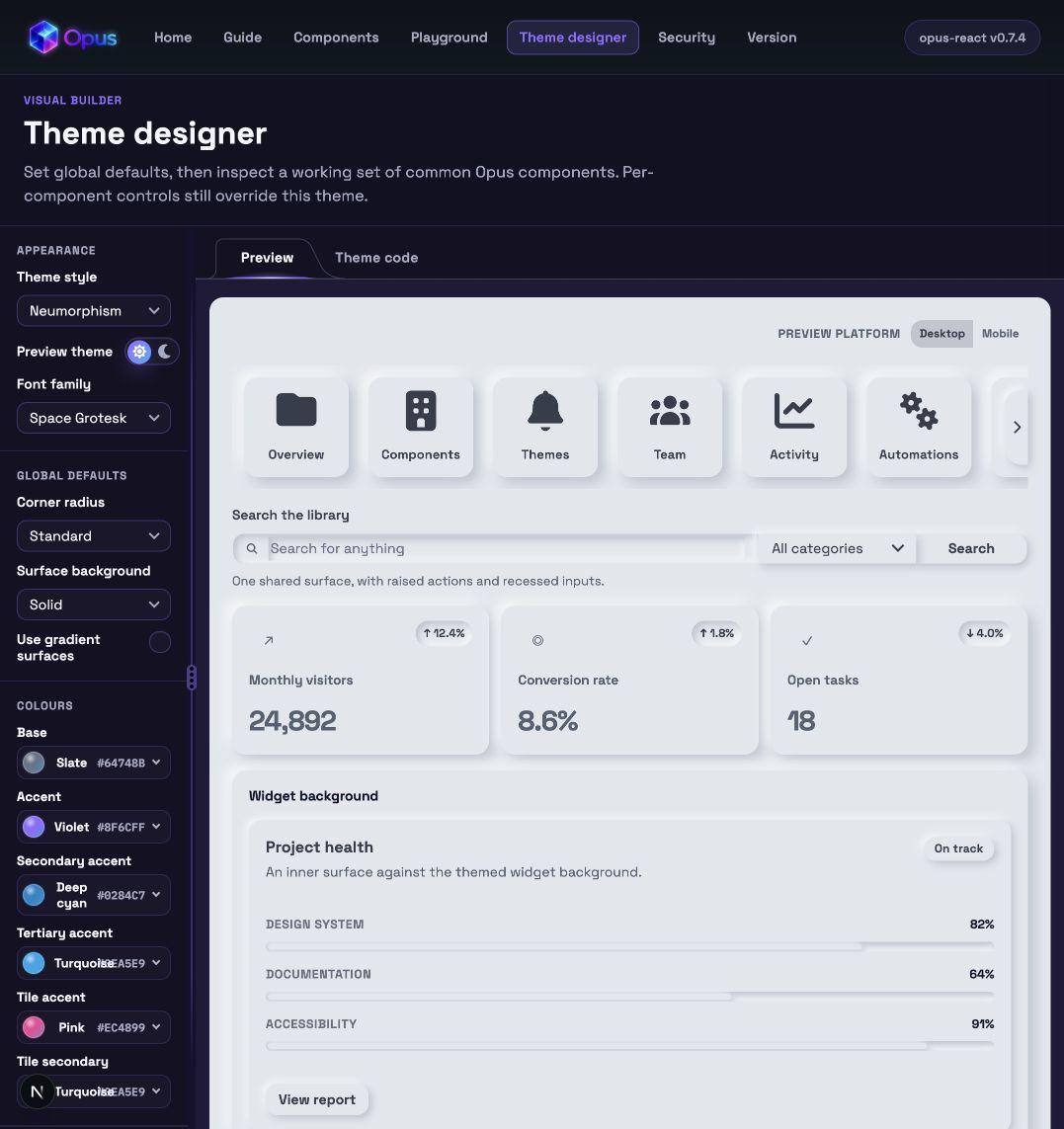
Opus 0.7.4 introduces a Neumorphism theme across the component library, with raised actions, recessed inputs, and a shared material colour in light and dark modes.
Controls feel moulded into their background. Soft light and shadow give surfaces depth without decorative outlines, while a restrained dark treatment keeps the effect subtle.
Explore the components
One material, shaped by light
Buttons and cards rise gently from the background; inputs sit within it. Matching surface fills and paired shadows create the relief, keeping the interface visually calm without adding borders around every control.
Light and dark, each with its own balance
Light mode gives the material a soft, tactile definition. Dark mode uses quieter highlights and shorter shadows so controls remain distinct without bright rims or a heavy bevel.
Across the component library
The appearance applies to shared surfaces across forms, navigation, cards, and overlays. Menus, dialogs, and tooltips carry their surrounding theme even when rendered through a portal. Focus indicators, validation feedback, chart colours, and imagery retain their purpose.
Try it, then take it into your app
Choose Neumorphism under Theme style in the Theme Designer while working locally, then copy the generated provider code into your app. The appearance is available now in opus-react 0.7.4 on npm and is opt-in for existing applications.