
Forms that feel finished
Text inputs, pickers, multi-selects, cascaders, rich text, password strength, and more — all wrapped in a consistent field shell with labels, help, and errors.
Design system · React 19 · npm · browser verified
Opus brings together forms, overlays, navigation, charts, application shells, desktop primitives, and production-ready compositions in one themeable system — with live documentation, editable previews, and usage examples verified against the real package.
Why Opus
Opus is both a component library and a documented system. Use the primitives directly in production, or browse the catalogue to validate patterns before you wire them into your product.
Text inputs, pickers, multi-selects, cascaders, rich text, password strength, and more — all wrapped in a consistent field shell with labels, help, and errors.
Light and dark modes ship out of the box. Accent colours can be changed at runtime without rebuilding your theme tokens.
Live previews, settings panels, generated usage code, and Open in Playground links make it easy to explore components before you commit them to a screen.
Interactive examples are exercised in a real browser for callbacks, navigation, value changes, visible state, and drag gestures. Presentational components receive explicit render coverage.
Dialogs, drawers, modals, popovers, toasts, sidebars, and top navigation — composed to work together across complex application shells.
Tables, charts, KPI cards, gauges, sparklines, and status indicators for dashboards that need more than a form on a blank page.
Login, register, Google and Apple continue, OTP, passkeys, forgot and reset password, check-email, verified, and expired-link screens — composed from the same field and button primitives as the rest of Opus.
CRM workspaces, authentication journeys, desktop environments, document managers, contact records, sales flows, maps, and media experiences — composed from the same published primitives.
Install `opus-react` from npm, import the styles once, and drop components into Next.js, Vite, or any React 19 project.
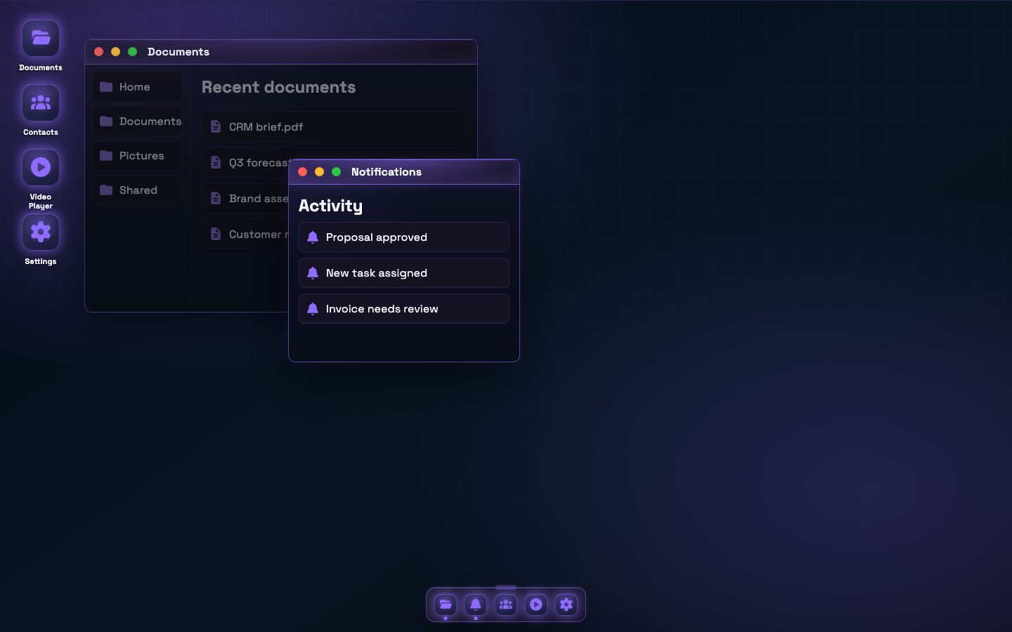
Desktop applications
Compose desktop-style products from the same accessible, typed React primitives as the rest of Opus. You define the apps and content; Opus provides the polished workspace and interaction model.
Code Playground
Jump from any component page into the Playground with generated JSX for your current settings, then tweak imports, state, and render logic before you paste it into your app. The same source is compiled for the catalogue preview, Playground, and external view, so the example you inspect is the example you run.
Real-world compositions
These are live Opus components from the npm package—the same contact and dashboard patterns available in the catalogue and editable Playground.

Head of Procurement
 Carl Fearby
Component library
Explore all 269 documented primitives, visualisations, application patterns, and complete compositions available in Opus today.
Expandable sections, grouped accordions, alerts, navigation menus, empty states, sidebars, and show more / show less controls.
Dashboard widgets, metric cards, progress components, profile panels, and data-rich summary blocks.
Inputs, selectors, toggles, buttons, and every field pattern used across Opus forms.
Charts and visualisations for comparing, trending, segmenting, and exploring metric data.
Experimental compositions that combine multiple library components into ready-made patterns — including CRM workspaces and a full authentication happy path.
Tooltips, command palettes, modals, drawers, and toast notifications for contextual help and feedback.
Application shells, setup boilerplates, and route-level pages such as error and access-denied states.
Workflow
Add `opus-react` to your app and import the base styles once in your root layout.
Use `OpusThemeProvider` to enable light or dark mode and runtime accent colours.
Drop in field components, overlays, and layout primitives with consistent spacing and states.
Open any component page, tune settings, then click Open in Playground to edit the generated JSX and preview it live before you paste it into your app.
import "opus-react/styles.css";
import "opus-react/index.css";
import { OpusThemeProvider, Button, TextField } from "opus-react";

export function App() {
  return (
    <OpusThemeProvider theme="dark">
      <TextField label="Company" placeholder="Acme Ltd" />
      <Button variant="primary">Continue</Button>
    </OpusThemeProvider>
  );
}
Help build Opus
Join us in building an accessible, dependable component system for modern business applications. Small fixes, focused components, tests, examples, and documentation are every bit as valuable as larger features.
Ready when you are
Install the library, browse the documentation, and experiment in the Playground before you bring a cohesive design system to your next product surface.